"We're planning to use in advocacy campaign for free and fair elections in the Nigerian general elections of 2011."
English | Español | ျမန္မာစာ | Беларуская
|
|
|
English | Español | ျမန္မာစာ | Беларуская 
|
|
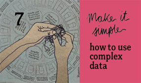
TACTIC 7: VIDEO
Submitted by richard on Fri, 05/21/2010 - 22:57
MAKE IT SIMPLEhow to use complex data download this tactic card (pdf 792kb) watch the full video
EXAMPLES FROM THE VIDEO
|
"We're planning to use in advocacy campaign for free and fair elections in the Nigerian general elections of 2011."
Terfa Hemen,
The Centre for Democracy and Development,
Nigeria
10 TACTICS for turning information into action BASICS every campaign should consider MORE GUIDES & TOOLKITS from tacticaltech | ||||